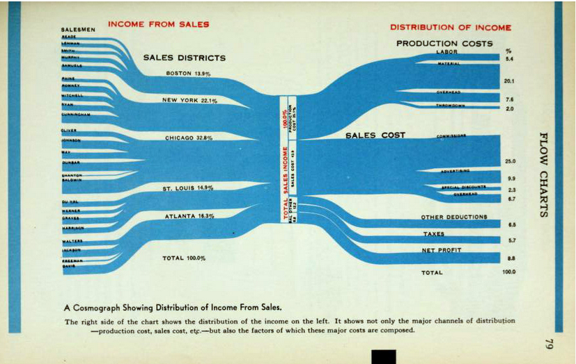
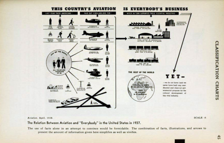
As educators, we love finding new ways to implement technology and keep things fresh for students.
As technology advances, so do the demands on educators: innovative, marketed content is no longer an innovation. It’s an expectation.
My friends at Weigle Information Commons sent over this article, featuring a How-to book on Infographics from 1914.
You heard me right: an infographic manual from 101 years ago.
A fan of sites like piktochart and canva, I loved reading about the history of these visual pieces which boomed in accord with the news demands around the wars of the 20th century. Like our students, the general public needed clear images and graphs to understand complex ideas around war and production.
It’s hard to believe infographics were actually created when Penn students dressed like this:
Informing and educating through graphics and flashy images is really nothing new and now I can justify the cost of the piktochart professional upgrade with 100 year old data.
All jokes aside, Brighton’s book offers a quick, integral reminder for all technology pioneers of 1914 that I really needed to hear:
“You can’t throw curves… for general use, graphic charts must be simple.”
That’s some 100-year-old wisdom that we can use today.
If our technological experiments in the classroom are simple, the failures and successes will be as well.
Small failures and setbacks have another term among educators—lessons. And small wins add up fast.
The next time I go to create a new infographic for a workshop or meeting, I’ll boil my content down even further.
And I’ll certainly be less likely to take free data visualization software for granted.
This blog post is brought to you in collaboration by:


Staff Blogger: Jen Papadakis


